How Localization contributes to accessibility
World Accessibility Awareness Day was recently celebrated. It is a date that is intended to raise awareness about accessibility and digital inclusion. According to GAAD estimates, more than one billion people worldwide live with disabilities or impairments.
For this reason, the objective of this day is to get everyone talking, thinking, and learning about digital access and inclusion.
Several events are held worldwide see the list here that aim to teach software creators and builders of online content to create first-rate digital experiences for users with disabilities.
When we think of factors that affect software accessibility, the first things that come to mind maybe
· Insufficient color contrast. ...
· Lack of keyboard access. ...
· Lack of visible or obvious focus. ...
· Lack of image descriptions or alt text. ...
· Improperly labeled controls.
But have you ever stopped to think about how Localization helps make a digital product more accessible?
Here are the localization elements that you should include in your localization strategy if you want to make an impact in the area of accessibility.
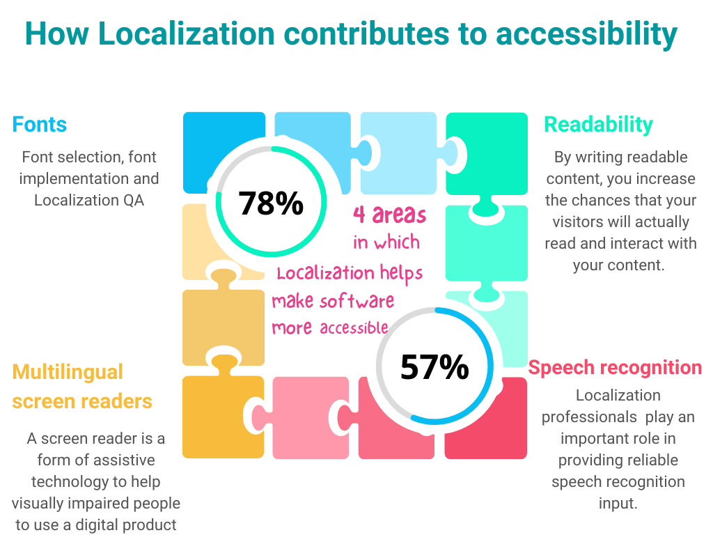
Use of fonts
A localization professional has a vital role to play when it comes to font integration in a digital product. Either helping to choose the best font for different markets or in the implementation phase (software internationalization or the Localization QA.
One of the big problems in using fonts and their impact on accessibility is that they can be difficult to read on mobile devices. Mobile screens are what they are, devices of a few inches that struggle to display fonts in a size that helps reading, and localized versions are on average 30% longer than the English version. That's why the Localization QA phase is critical to detecting readability issues.
There is one thing we must be clear about, not all fonts are good fonts from an accessibility perspective. There are three key factors to consider a font accessibility friendly.
Size
Color
Contrast
Fonts that are very elaborate or ornate can be challenging to read or see clearly as the letter shapes are not well defined or regular in shape and size.
Choosing an accessible font is very important because an accessible font will not exclude nor slow down the reading speed of any user with blindness, vision loss, or reading disorders.
According to recite.me, a company specializing in accessibility, Arial is one of the most accessible fonts we can use. Other fonts that are also accessibility friendly include Calibri, Century Gothic, Helvetica, Tahoma, and Verdana.
Readability
Readability is not only about the content being readable by using the right font size. This is something that the Localization industry has deeply embedded in its DNA.
Readability is about making content clear and easy to understand. By writing readable content, you increase the chances that your visitors will actually read and interact with your content.
Siteimprove gives us the following 5 tips to créate readable content
1.-Ensure sentences are 20 words or less
Sentences longer than 20 words are harder to read and understand. If you need to use a long sentence, try to limit it to one long sentence per paragraph.
2.- Use shorter words when possible
Words with four or more syllables are considered difficult to read. If you need to use long or difficult words, try to keep the overall sentence short.
3.-Avoid using jargon
Unless you’re writing something for a specific industry, you should avoid using jargon in your writing. Be certain that jargon is only used when it’s appropriate for the target audience.
4.-Use personal pronouns when appropriate
Use “we,” “our,” “you,” and “your” in place of your organization’s name or when referring to your reader. This helps shorten your writing and will make your writing flow better.
5.-Add transitions
Using transition words and phrases, such as “overall,” “in fact,” “ultimately,” etc., will help guide readers through your content. Transitions can also help break up a more difficult text.
Speech recognition and Voice Commands
Speech recognition can be used in several ways. One of them is dictating text in a form field, as well as navigating to and activating links, buttons, and other controls.
The other, closely related to the previous one, is the ability of a product to receive commands in various languages.
Localization professionals obviously play an important role in providing reliable speech recognition input.
Multilingual screen readers
A screen reader is a form of assistive technology to help visually impaired people to use or access the computer and Internet.
In the past, it was a technology mainly applied to English content, but today that has changed drastically.
Google's Talkback application is a clear example of this. Google Talkback allows visually impaired people to use mobile devices without the need to see, guided only by voice messages that describe and read the content displayed on the screen.
Languages support in GoogleTalk
The list of supported languages is quite complete!
In summary
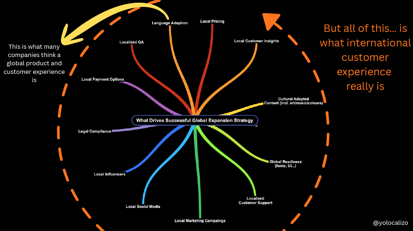
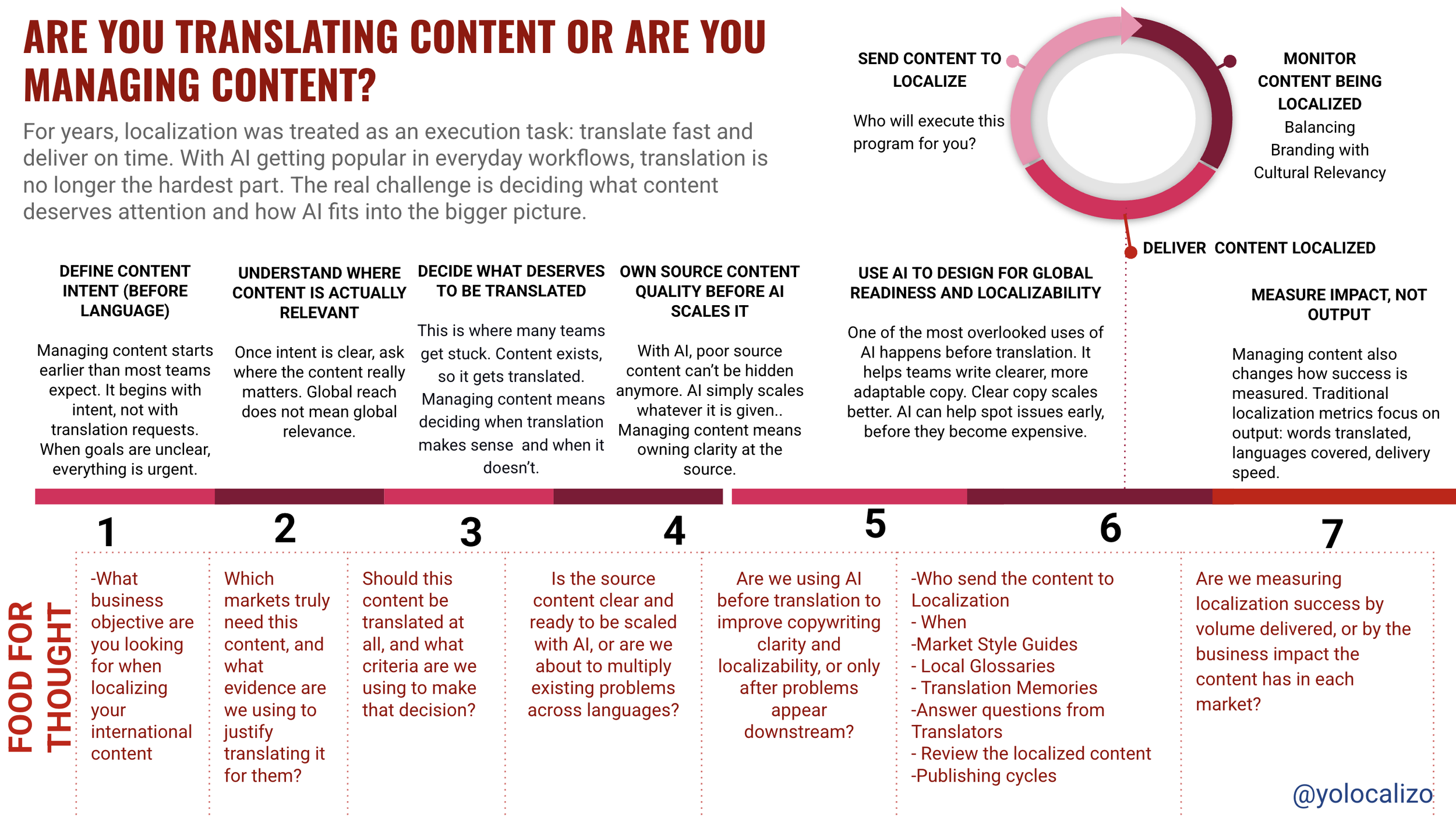
Localization is a discipline whose main objective is to reduce the friction between content and the people who consume content. We often think that reducing friction is limited to the translation phase. To the Localization of content to make it accessible to non-English speakers. This mission is empowering enough in itself, connecting content and services with consumers who prefer to use their native language, but Localization's activities don't stop there, they go much further.
Fonts, readability, speech recognition, and multilingual screen readers represent other ways in which the Localization industry contributes to making content more accessible.
Let’s keep working together to make the software more accessible! Well worth the effort
@yolocalizo






Reading The Myths of Happiness reminded me of the arrival fallacy: the belief that once we reach a certain goal, everything will finally feel solved. In localization, that can look like waiting for the day when people will finally understand what we do. But organizations keep changing, so that moment may never fully come. And maybe accepting that is exactly what helps us stay grounded, avoid frustration, and keep moving forward.