LOCALIZATION IS USER EXPERIENCE
What is user experience?
If you want a great definition, browse Google, and I'm sure that among the about 1,740,000,000 results that come up, you will find some explanation that will satisfy you. From the why to the what to the how of product use.
And if you don't want to complicate your life, we can simplify, we can define user experience as ... a nice feeling when using a product.
I often hear/read UX Design is User-Centered.
We have to put the user at the center of the product we develop.
We have to make sure we understand their motivations and give them the features they need.
We have to make sure we design for humans.
Perfect, all that is important, and these are undoubtedly factors that we must consider when designing a digital product.
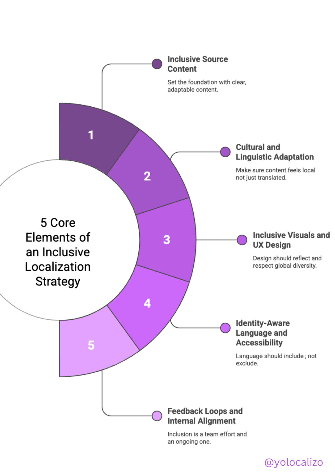
But there is one aspect that is often overlooked when making a user-centered/human design product... and it is paradoxical ... that aspect is ... language.
Please stop and think about that for a moment,
Is there anything more human than language?
Is there anything more user-centric than giving the user the product in their native language?
Language, culture shapes the way we view life, shape our relationships, and obviously shape the way we interact with a product.
When a company is developing a global product, it is necessary to stop and think about how to extend the user experience globally.
How to localize the user experience
You cannot design a global product if you don't consider line heights and font sizes, so preparing your UI to accommodate languages that have different line spacing and font sizes is essential.
We must remember that the orientation might be different, and that means that the User experience of a product design in English is very different from Arabic or Japanese to give an example.
Currencies are also different, decimal points are different, and what to say about the length, that's also different. English is shorter than other languages such as Brazilian, Portuguese or German, so to deliver a good UX in those markets, you must change the mindset and consider that Localization is UX. It's vital to design localization-friendly products from a UX perspective.
To design a multimarket user experience follow these suggestions
1.-Prepare your content to handle different screen sizes
Your UX might operate in a mobile screen, a tablet, a smartwatch, or a computer. Factors from a UX perspective to consider when approaching different screen sizes are the following:
It's required a different UX strategy for each screen size. Reflect on the amount of screen space needed to display information
Consider different lengths per language of the form fields to validate info.
Allow space for text expansion (localized languages average 30% longer than English)
Fonts impact the amount of space used in a device.
Consider mirroring effect for RTL languages, and they flip the order of your UX experience.
2.- Cultural factors
Culture impact, one size fits all, does not work anymore.
Factors from a UX perspective to consider when approaching cultural factors in the design of our UX are the following
Study and apply the cultural dimensions of the Geef Hofstede model.
Cultural differences impact how our users interact with our content
Understand the value that different cultures place on specific colors
Flags sensitivity: country vs. region
The tone of voice (some cultures approach jokes, humor, formal/informal communications from different angles
Build credibility in your UX design (include empathetic images that are relevant to the context of the user, include widgets like trust badges, ratings, awards in a visible place, and display testimonials as social proof to visitors to increases credibility and trustworthiness)
3.- Internationalization
Designing for international audiences is a complex task. Factors from a UX perspective to consider when approaching cultural factors in the design of our UX are:
Decimal or Thousand separator
Measurement units
Date format
Name and title
Timezone
Calendar (weeks start on Sun or Mon)
Currency Symbols
Length of the phone numbers
Address formatting
Click HERE to download the infographic
4.- UX Writing Words matter!
We don't have to forget that the copy is often the most human part of the entire interaction with a product. Users want more than design and colorful images. Users want to understand, and the copy is, therefore, a crucial step to start a conversation with our users. Factors from a UX perspective to consider when approaching UX writing
Small sentences/fewer words – Get to the point.
Create scannable content with eye-catching and concise headlines. Users don't read everything; they scan for specific words.
Be consistent in the use of your wording. Use terminology databases/glossaries.
Your style guide is crucial (active verbs instead of passive, use positive language, avoid double negatives)
A/B test your UX writing
Don't use jargon
Strong Calls to Action
Conclusion
UX designers should support localization early in the design process with the above considerations in mind. And Localization specialists need to find a seat in the table of the product roadmap to ensure global designs parameters are considered.
After all, when designing global products, you can't take the human element out because language is a human thing.
We create products for humans, and there's nothing more human than language.
That's why I believe that Localization is User Experience.
Have a great week!
@yolocalizo


Localizability has always been a challenge small issues in source content often lead to big problems later in translation. In this post, I explore how AI is giving localization teams a powerful new way to improve source quality, reduce friction, and create better content for every market right from the start.