The Role of Localization in Accessibility
Accessibility and localization have more similarities than it might seem. Both aim to reach the maximum number of people and focus on removing barriers—whether physical (e.g., controllers for people with motor difficulties) or linguistic (a language that is not understood is a barrier). They also face similar challenges. Just as making a product accessible is often thought to be the responsibility of a few individuals, the same goes for localization.
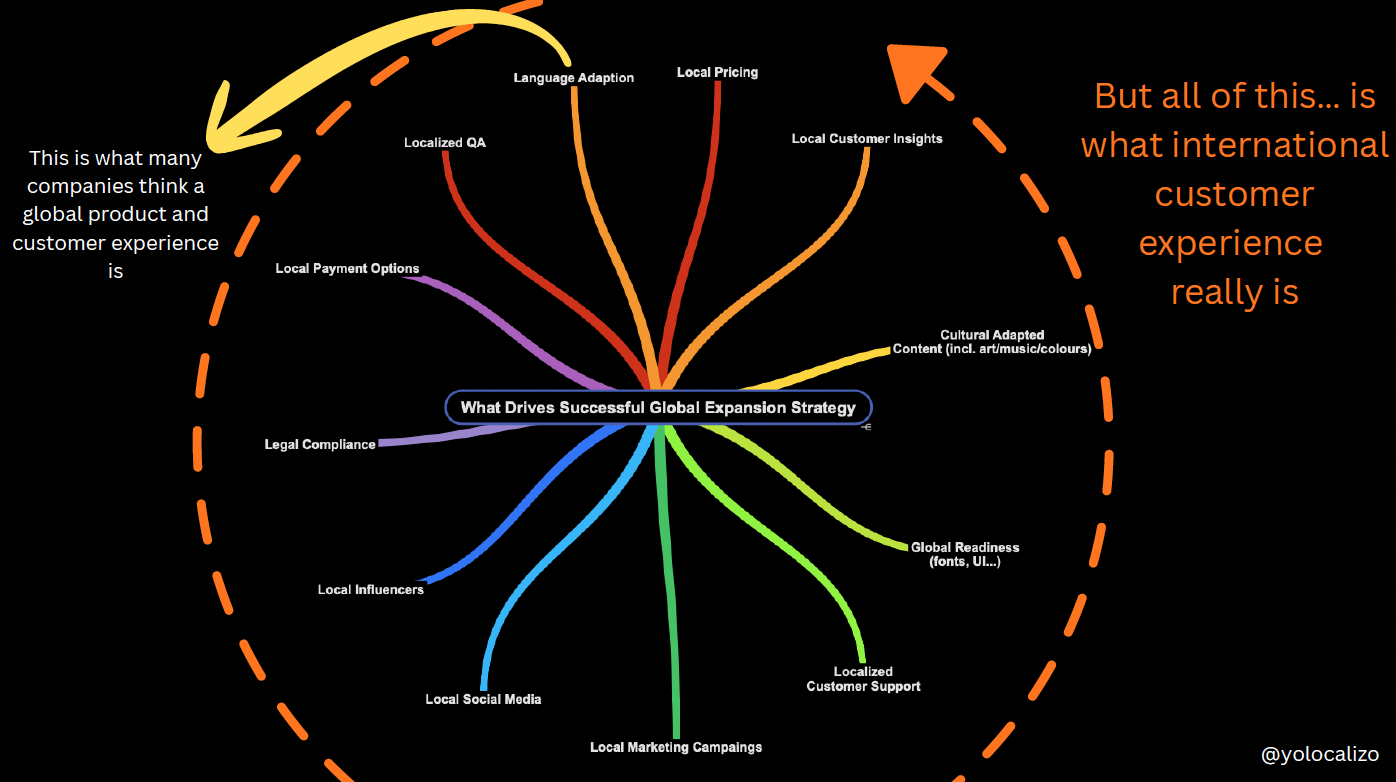
Every decision a team makes affects not only a digital product's accessibility but also how easily it can be adapted to different markets. Therefore, everyone involved in creating software can help improve both accessibility and localizability. Accessibility is a core consideration in software development and must be integrated into the entire process. The same applies to localization. The best time to consider localization is during the product's ideation phase. The sooner we start thinking about adapting experiences for different markets and making the product usable for as many people as possible, the better.
Taking advantage of this week's Accessibility Awareness Day, this post explores how accessibility and localization can join forces to remove barriers.
Localization and accessibility joining forces to remove barriers
Accessible design creates products usable by those with disabilities. Localization helps create products for the widest possible audience, including but not limited to people with disabilities. Below are two areas traditionally falling under localization activities that are crucial for developing accessible products.
Clear and Simple Content
As of 2022, the overall literacy rate for adults aged 15 and above is approximately 87.01% (statista.com). Low literacy can also arise contextually for individuals whose first language differs from their native language. We can make software more accessible to people who struggle with literacy by making copy as simple as possible. Therefore, writing in plain language and localizing content with that in mind is helpful, as not everyone can read and understand English as well as native speakers. We can make a digital product much easier to use by making it friendly to other languages.
Clear, direct language improves readability and comprehension, benefiting everyone. Below are some best practices to follow to increase readability, which immediately impacts making content more accessible
Best Practices for Improving Readability
1. Ensure sentences are 20 words or less: Sentences longer than 20 words are harder to read and understand. If you need to use a long sentence, try to limit it to one long sentence per paragraph.
2. Use shorter words when possible: Words with four or more syllables are considered difficult to read. If you need to use long or difficult words, try to keep the overall sentence short.
3. Avoid using jargon: Avoid using jargon in your writing unless you’re writing for a specific industry. Ensure that jargon is only used when appropriate for the target audience.
4. Use personal pronouns when appropriate: Use “we,” “our,” “you,” and “your” instead of your organization’s name or when referring to your reader. This helps shorten your writing and improve its flow.
5. Add transitions: Using transition words and phrases such as “overall,” “in fact,” “ultimately,” etc., helps guide readers through your content and breaks up the more difficult text.
Font and Typography
A localization professional plays a vital role in font integration in a digital product, from helping to choose the best font for different markets to ensure implementation during the software internationalization or Localization QA phase.
One of the big problems in using fonts and their impact on accessibility is that they can be difficult to read on mobile devices. Mobile screens are small and localized text versions are, on average, 30% longer than the English version. That's why the Localization QA phase is critical to detecting readability issues.
Key Factors for Accessible Fonts
- Size: Ensuring font sizes are large enough to be legible for visually impaired users. The generally recommended font size is 16 pixels or larger.
- Color: Ensuring sufficient contrast between text and background colors for readability.
- Contrast: Avoiding thin typefaces, especially at small sizes, as they can be hard to read. Opt for fonts with a higher contrast against the background.
- Line Length and Spacing: Ensuring that text lines are not too long or too short. A balanced line length improves readability and reduces eye strain.
- Adaptation for Reading Direction: Adjusting text alignment and layout for languages with different reading directions (e.g., right-to-left languages like Arabic and Hebrew).
Fonts that are very elaborate or ornate can be challenging to read as the letter shapes are not well-defined or regular in shape and size. Choosing an accessible font is crucial because an accessible font will not exclude nor slow down the reading speed of any user with blindness, vision loss, or reading disorders.
According to Recite.me, a website focused on creating inclusive experiences online (https://reciteme.com), Arial is one of the most accessible fonts. Other accessibility-friendly fonts include Calibri, Century Gothic, Helvetica, Tahoma, and Verdana.
Conclusion
Accessibility is the responsibility of everyone involved in the design and development process. By incorporating accessibility from the beginning, we can create digital products that are usable by the widest possible audience, including those with disabilities. Localization is crucial in this process as it aims to reduce the barriers between content and its users. This often starts with translation, making content accessible to non-English speakers. However, localization goes beyond just translation.
Fonts and readability are other areas where localization helps make content more accessible. Let’s keep working together to make software more accessible. It is well worth the effort.
@yolocalizo
Further references
Microsoft Best Practices for Inclusive Design a helpful collection of principles to focus on creating products and services that are accessible and usable by the widest possible audience, regardless of their abilities or disabilities
Microsoft Best Practices for Accessibility is a helpful collection of principles and practices to ensure that products and services are usable by everyone
Bonus point - Bonus Points: 5 Extra Strategies to Enhance Product Accessibility
Bonus point - extra tips accesible products
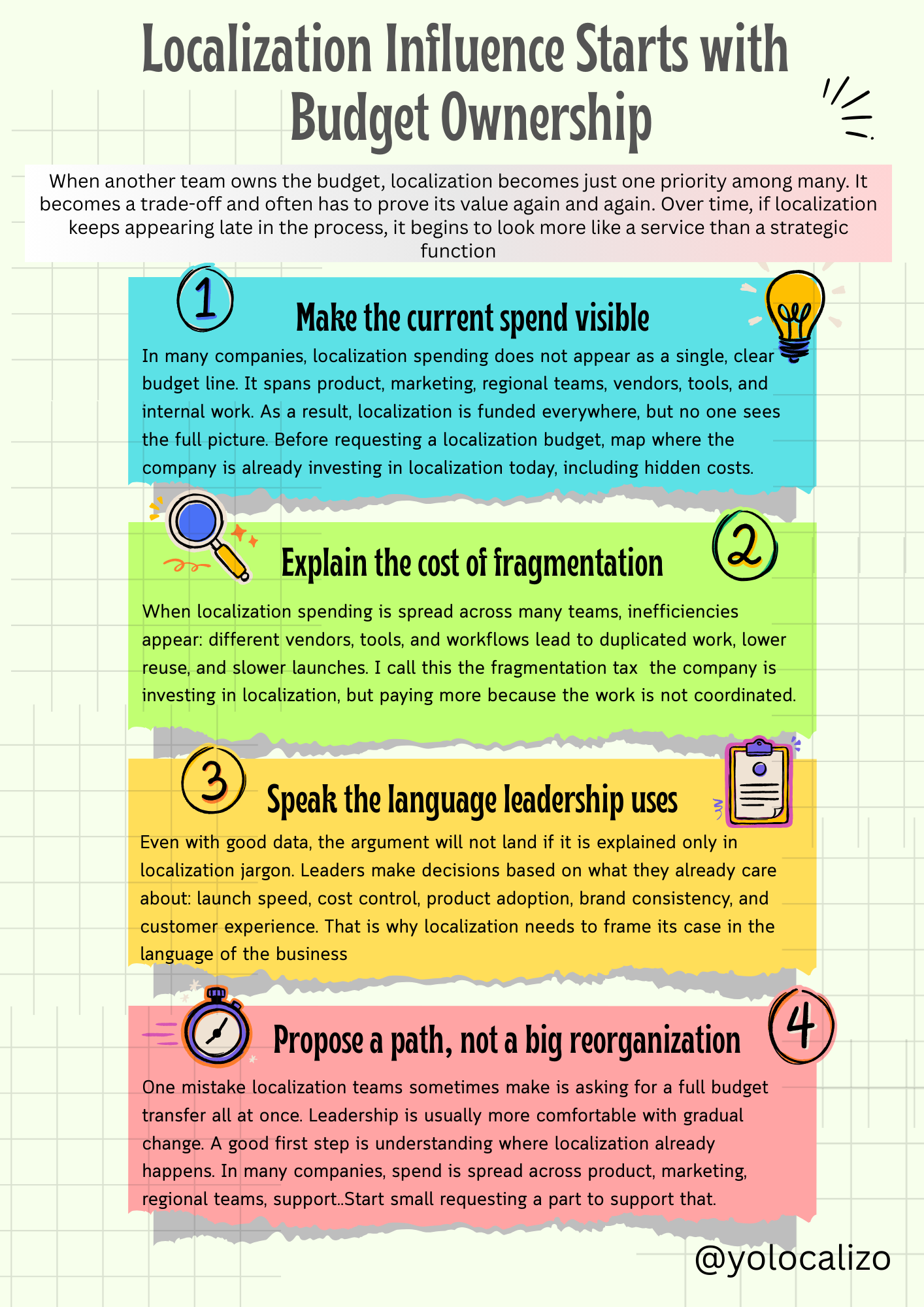
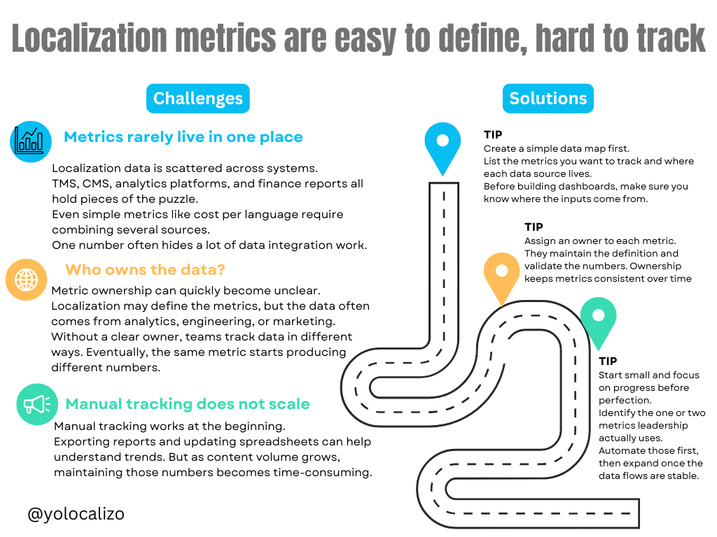
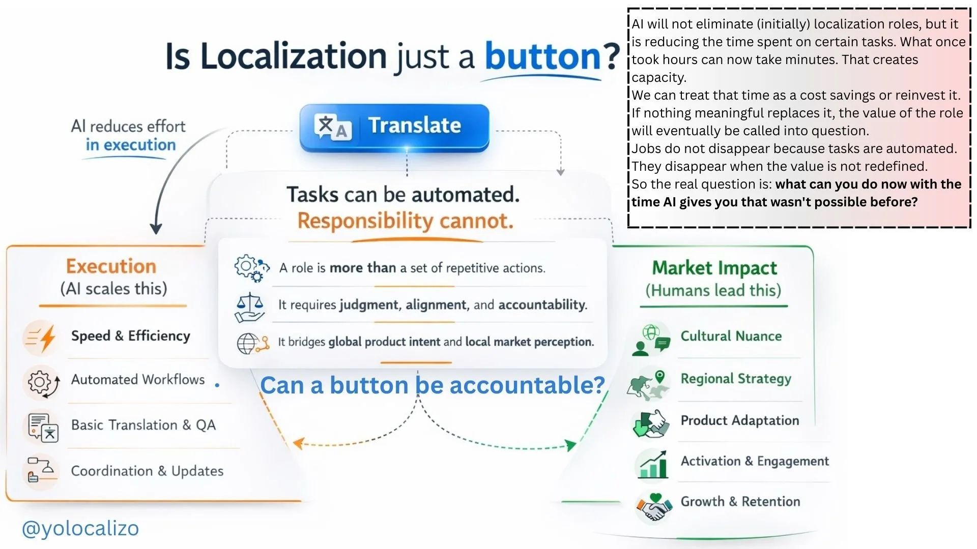


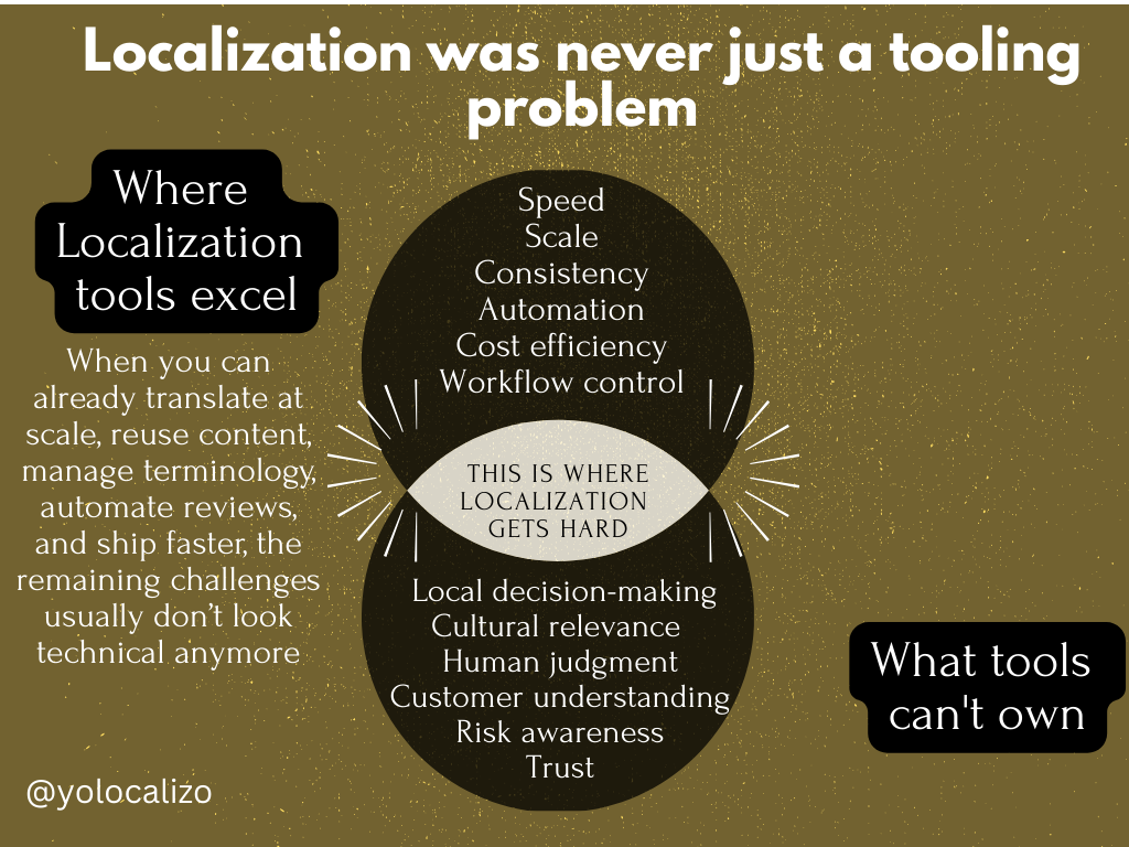
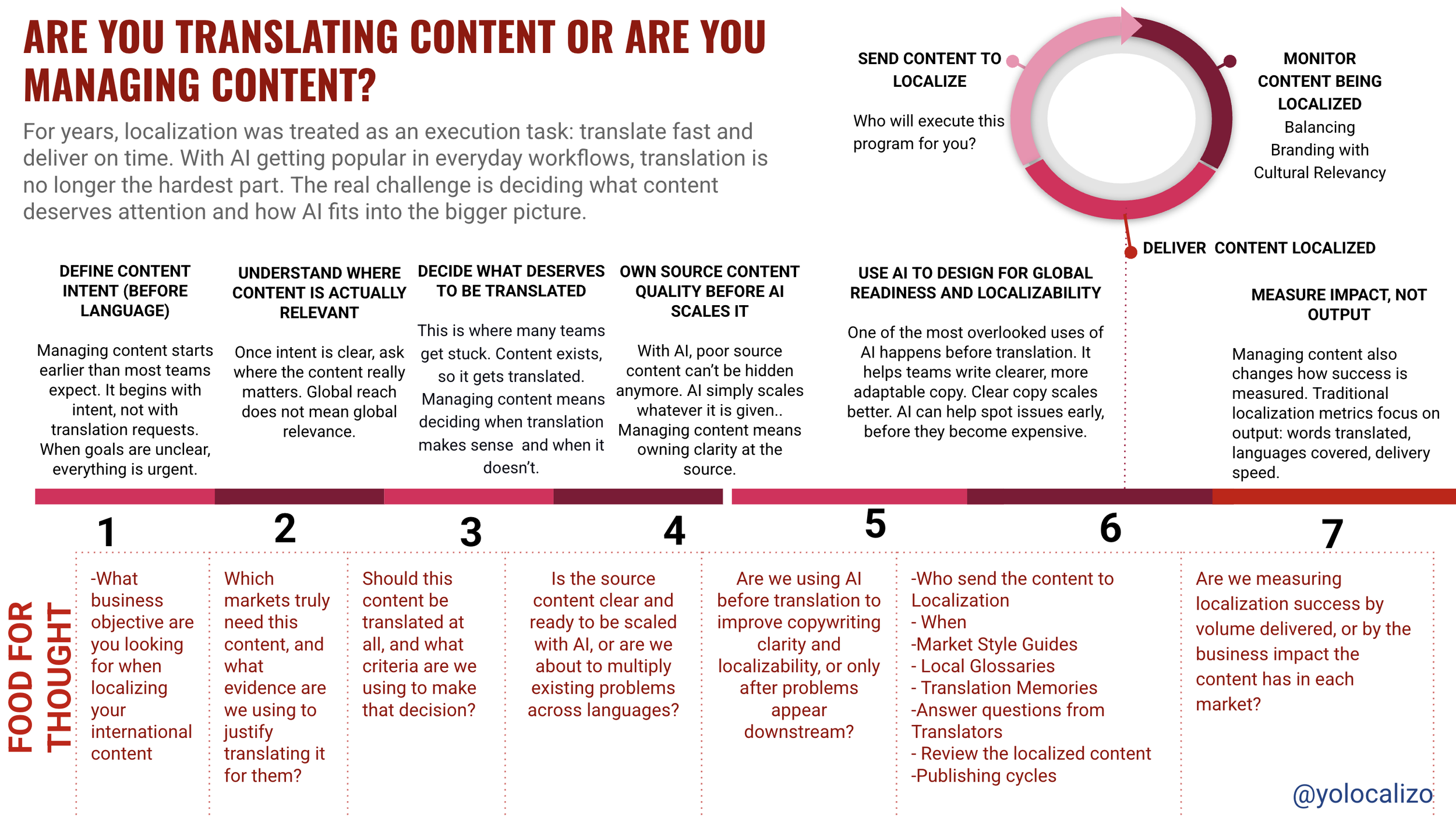


Reading The Myths of Happiness reminded me of the arrival fallacy: the belief that once we reach a certain goal, everything will finally feel solved. In localization, that can look like waiting for the day when people will finally understand what we do. But organizations keep changing, so that moment may never fully come. And maybe accepting that is exactly what helps us stay grounded, avoid frustration, and keep moving forward.